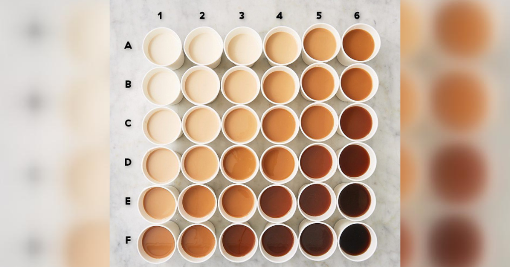
This coffee-and-cream chart generated a lot of discussion on the internet

We all have things we are picky about, whether we’re high maintenance or not. That’s OK.
Still, being specific can elicit strong feelings, and one of the things about which most of us are most particular is our morning coffee.
When you first start drinking coffee on a daily basis, usually around college — maybe even around finals — you have a choice to make: how you’re going to take it.

And maybe you tinker for a while to find the ideal balance of creaminess and sweetness to create the most delicious combination possible — Hell, maybe you figure out how to do it all in a different language just to spice things up.
However, once you’ve found your own blend, it’s likely that you’ll be stuck in it for the rest of your life.
This leads us to this chart.

It’s essentially a lightness-to-darkness scale for the amount of cream in a coffee, ranging from a cup of cream at A1 to the dark, bitter, cream-free F6.
Delish shared this chart on Instagram because they were intrigued to see where people’s coffee tastes would land them. They undoubtedly received far more than they bargained for.
You never know what you’re going to get in a comment section.
Even those who fell halfway in the middle were passionate about their decision.
Although, in my opinion, distinguishing D4 from E3 or F2 requires a pretty strong eye. So there should be some wiggle room on this chart, right?
However, it’s a quite complete gradient, and at least a few people have plans to use the chart in the real world.
I’m not sure why Delish would have a makeup chart, but I can see how it could be mistaken for anything else at first glance.
So, where do you stand on the scale of coffee and cream?


